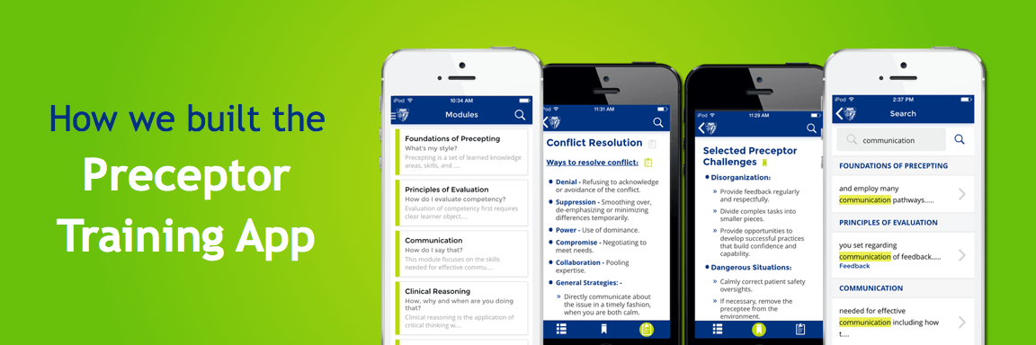
It was a roar of pride for us when John Hopkins School of Nursing approached us to build an app for preceptor training. Our excitement knew no bounds! This app needed to be a companion app that would work in tandem with the successful online training program run by JHU, which was a step to advance nursing and healthcare worldwide.
As precepting is essential in boosting and promoting skills, competence and confidence in future nurses, we at Vigyanix believed to make this app a highly intuitive and an easily accessible resource regardless of the platform or device being used.
We wire framed, researched and recapitulated numerous designs. Our lofty goal required us to go through a long drawn process that included testing of various elements such as UI patterns in order to apply them while attaining great user experiences for preceptors and nurses.
Building the initial prototype was a crucial part of testing It helped us to quickly identify and resolve common problems while using the application. This led to achieving the natural user flow in the final stages of our app idea. Our challenges helped us in eventually converting them into app features. Learn more about Preceptor training app.
Learn as you go
JHU wanted an easy to use app, so we focused on a simplified user interface, charting out a design that was easy to understand. We brought down more than 9 hours of training programme into an easy to access companion app.
Real time sync
Preceptors and nurses wanted to be able to view the modules on any device. Real time syncing of all the notes and bookmarks made it possible to have the app synced across all platforms.
Offline Searches made possible
Easy accessibility being an integral nature of the app meant preceptors to have immediate access to the 9 modules anywhere anytime according to their convenience. This also meant that the app would have an offline search feature. Finding content by topic or keyword without the need to be online made it convenient for trainees to search for anything with ease.
Taking notes made easy
We enabled notes feature against each topic of the module, at the touch of the icon. This would mean that users can jot down important points keeping it synced with the topic it relate to.
Easy share your notes
As soon as we decided upon having notes feature enabled, we knew making these notes sharable was going to be the next challenge for us. We included email mode for sharing; keeping in mind ease of use and user preferences.
Bookmark your favorites
We thought about adding the bookmark feature against each topic similar to adding notes feature. Bookmarking made it possible for preceptor training app users to save all shortcuts, find their favourite content and access them easily in real time.
Multiplatform
With iOS and Android having 96.3% of the operating system market share, it is well understood that compatibility of an app with various platforms and devices is a must for an apps success. JHU wanted preceptor training to be a cross platform app in order to reach wider audience. So decision was made to support these two platforms so as to support the purpose of the app.
Nonetheless, flexibility and vast experience of the team with previous projects in the same market gave us thrust in the right direction. Preceptor training is definitely an app made for the ultimate satisfaction of its end users i.e., preceptors and nurses of the future.


